

How to Design a Retail Store Layout That Maximizes Sales Floor Performance
Quick answer: Retail space planning is the process of arranging a store so that customers see more product, move comfortably, and reach the till without friction. The four main retail store layout types are grid, racetrack (loop), herringbone, and free-flow, and the right one depends on the shape of your unit, the size of your range, and how your customers shop. A strong plan keeps the entrance clear, protects the sightline to the back wall, sizes aisles from code minimums upward, and places the sales counter where the customer journey naturally ends.
Canadian retailers sold $837.2 billion worth of goods in 2025, and Statistics Canada reports that online sales made up only 6.1 percent of total retail trade in December 2025. The physical store is still where most retail revenue is earned, and the layout of that store decides how hard each square foot works. Done well, retail space planning shows up in the metric landlords and retailers both watch most closely: sales per square foot.
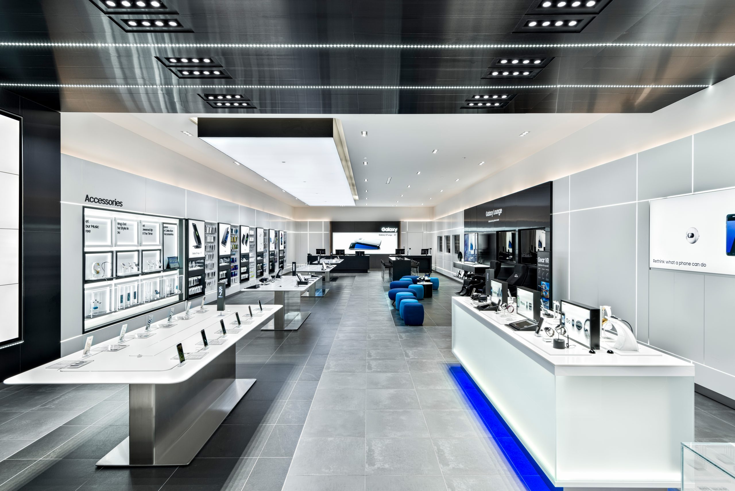
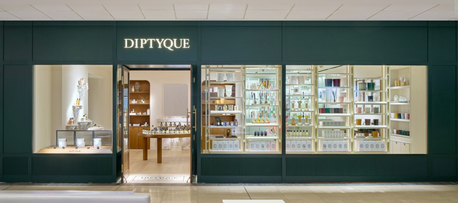
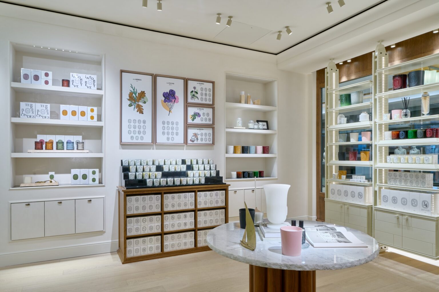
The gap between strong and average stores is wide. According to ICSC data published by Retail Insider, Yorkdale Shopping Centre in Toronto recorded $2,368 in sales per square foot in 2025, and CF Pacific Centre in Vancouver recorded $1,593. Those centres charge rents that punish wasted floor, so the tenants who succeed there tend to plan every metre of their layout with intent. Cutler has designed stores in both centres, for brands including Michael Hill Jewellers, Samsung, and Diptyque, and the lessons from that work apply to a 1,200 square foot boutique as much as a flagship.
This guide is a tactical companion to our retail space design guide, which covers lighting, visual merchandising, and design on a budget. Here, the focus is narrower and more practical: the main retail store layout types and when each one earns its keep, how shopper behaviour should shape the plan, how to calculate the split between fixtures and circulation, where the sales counter belongs, and how to work with a design team to get the most from your floor.
What retail space planning actually measures
A store layout is judged on numbers, so it helps to know which ones matter before a single fixture is drawn. Sales per square foot is the headline figure, but it is an average that hides a lot. Two stores with identical sales per square foot can have very different layouts underneath: one where the front third of the floor carries the business and the back is dead space, and another where performance is spread evenly. Good retail space planning aims for the second pattern.
Planners also track sales per linear foot of fixture, which tells you how productive your walls and gondolas are, and conversion rate, which is the share of visitors who buy. Dwell time sits behind both. Customers who stay longer see more product and tend to spend more, which is why a layout that slows people down in the right places usually outperforms one that simply moves them efficiently from door to till.
The last number to understand is the difference between gross leasable area and net selling area. Your lease is priced on the gross figure, but only the net selling area generates sales. Stockrooms, fitting rooms, staff areas, washrooms, and the cash wrap all come out of the total before you place a single rack. The more carefully that split is planned, the more of your rent is working for you.
The main retail store layout types
Most stores are built on one of four layout typologies: grid, racetrack, herringbone, or free-flow. Each one suits a different combination of unit shape, product category, and shopping mission. In practice, many successful stores blend two of them, but it is worth understanding each type on its own terms first.
Grid layout
The grid arranges fixtures in long parallel runs with straight aisles between them. It is the layout of grocery stores, pharmacies, hardware stores, and convenience retail, and it exists because it holds the most product in the least space. Customers on a mission find what they came for quickly, and staff can restock efficiently. Signage at the end of each aisle does much of the navigation work.
The weakness of the grid is that it discourages browsing. Shoppers walk the aisle they need and skip the rest, and the long runs block sightlines across the store. If you use a grid, the end caps become your most valuable merchandising positions, and the back wall should carry a destination category that pulls people past everything else. For specialty retail with a large SKU count, such as a pet supply or home goods store, a grid in the core of the store can work well when it is softened by feature displays at the front.
Racetrack (loop) layout
A racetrack layout sets out a clear main aisle that circles the store, usually defined by a change in flooring, with merchandise on both sides of the loop and departments branching off it. It is the classic department store plan, and it works because it exposes every customer to most of the range. The loop does the navigation for them, so shoppers rarely feel lost even in large stores.
For the racetrack to perform, the loop has to be wide, obvious, and uninterrupted. If customers can shortcut across the middle, many will, and the far side of the loop loses traffic. The layout also needs enough floor area to work. In a unit under about 3,000 square feet, a formal racetrack often consumes too much space in circulation, and a lighter version, with a perimeter path and a free-flow centre, tends to perform better.
Herringbone layout
The herringbone is a variation on the grid designed for long, narrow units. A single main aisle runs from the entrance to the back of the store, and shorter aisles or fixture runs angle off it on both sides, like the bones of a fish. It is common in bookstores, specialty food shops, and older street-front retail, where the unit might be 18 feet wide and 80 feet deep.
The advantage is that the angled runs open up sightlines from the main aisle, so shoppers walking toward the back can see into each side bay. That helps solve the core problem of a deep narrow unit, which is getting people past the first 20 feet. The trade-off is limited flexibility. Once the herringbone angles are set, reorganizing the floor for a new season or product launch is harder than with free-standing fixtures.
Free-flow layout
A free-flow layout abandons fixed aisles and places fixtures, tables, and displays in an open arrangement that invites customers to wander. It is standard in fashion, beauty, jewellery, and lifestyle brands, and it gives product room to breathe. It also has the highest ceiling for brand expression, since the plan can be shaped around focal points, feature walls, and moments that reflect the brand.
Free-flow is also the easiest layout to get wrong. Without a strong hierarchy of sightlines and focal points, it can feel aimless, and customers may leave after a lap of the first third of the store. It typically holds less product per square foot than a grid, so the merchandise and price point need to justify the space. Jewellery, fragrance, and beauty brands often favour free-flow planning because their product benefits from space, light, and a slower pace.
Choosing between them
The table below summarizes where each layout type tends to fit best. Treat it as a starting point for the conversation with your designer, not a rule, because unit shape, frontage, and landlord criteria can all change the answer.
| Layout type | Best unit shape | Best suited to | Product density | Browsing and discovery |
|---|---|---|---|---|
| Grid | Wide, rectangular | Grocery, pharmacy, hardware, high SKU counts | Highest | Low |
| Racetrack (loop) | Large, roughly square | Department stores, big-box specialty, larger apparel | High | High |
| Herringbone | Long and narrow | Books, specialty food, street-front retail | Medium to high | Medium |
| Free-flow | Any, works best with good frontage | Fashion, beauty, jewellery, lifestyle, showrooms | Lowest | Highest |
Hybrid layouts are common and often the right answer. A typical apparel store might run a perimeter loop along the walls, where the bulk of stock is held, with a free-flow core of tables and feature fixtures. A furniture showroom might combine a guided path with room-set vignettes. The key is that the hybrid is deliberate, with each zone given a job, rather than the result of fixtures being added over time.
How shopper psychology should shape the plan
Much of what designers know about in-store behaviour traces back to the work of retail researcher Paco Underhill, whose firm spent decades filming and tracking shoppers. Three of his findings are especially useful for layout decisions, and each one translates into a specific planning move.
The first is the transition zone, often called the decompression zone: the first several steps inside the entrance, where customers are adjusting to the change in light, temperature, and pace. Shoppers tend to overlook product and signage placed in this zone. The planning response is to keep the zone open and uncluttered, then place the first strong display just beyond it. In a small boutique, that zone may be only 5 to 6 feet deep. In a large-format store, it can run 10 to 15 feet.
The second finding is that most shoppers in North America drift to the right after entering. The front-right wall, sometimes called the power wall, is therefore the store’s most visible merchandising position and should carry new arrivals, a hero product, or the season’s key story. The right-hand drift also sets the natural direction of travel, so many customers circulate counter-clockwise, which has consequences for where the cash wrap goes, as covered below.
The third finding is what Underhill called the butt-brush effect. Shoppers, and particularly those browsing closely at a fixture, tend to abandon a display if they are bumped from behind by other people in the aisle. Aisle width is therefore a sales issue as well as a code issue. Narrow aisles beside your most engaging displays suppress the very browsing they were designed to encourage, and they make the store harder to use for anyone with a stroller, a mobility aid, or shopping bags.
Sightlines and traffic patterns
A sightline is simply what a customer can see from where they are standing, and the layout controls it. The most important sightline in any store runs from the entrance to the back wall. If shoppers can see an appealing feature at the rear of the store, they will walk toward it, passing everything in between. If the view is blocked by tall fixtures near the front, many will never go further than the first bay.
The practical tool here is fixture height. A common approach is to step fixture heights up from front to back: low tables and platforms near the entrance, mid-height fixtures in the middle of the floor, and full-height wall fixtures around the perimeter. Keeping fixtures in the front of the store below average eye level preserves the view to the back wall while still holding plenty of product. The back wall then becomes a destination, whether it is a feature display, a service counter, or the category customers come in for.
Traffic patterns follow from sightlines. Designers map the intended path through the store, then place destination categories and high-demand items so that the path covers as much of the floor as possible. Feature tables and changes in flooring act as speed bumps that slow customers down and invite a pause. The goal is a route that feels natural to the customer and deliberate to the retailer, with no dead-end corners and no zone that the average shopper never reaches.
Hot and cold zones are the result. Every store has areas that see heavy traffic and areas that see little, and planning should assign merchandise accordingly. High-margin and impulse items belong in the hot zones near the main path and the till. Cold zones, often the back corners and the left side near the entrance, need a reason to be visited, such as a fitting room, a service point, or a well-lit destination category.
How to calculate fixture space versus traffic flow
Every retail floor is a trade between product and circulation. Too many fixtures and the store feels cramped, shoppers skip crowded bays, and accessibility suffers. Too few and the store looks sparse, holds too little stock, and fails to earn its rent. Retail space planning finds the right balance for the category, and the calculation starts with the net selling area.
Begin with the gross area of the unit and subtract everything that is not sales floor: stockroom, staff room, washrooms, fitting rooms, and the cash wrap and its queue space. Back-of-house needs vary widely by category. A jewellery store with small, high-value stock may need little storage beyond a safe, while a footwear retailer holding sizes for every style may need a quarter or more of the unit for stock. Then set aside the decompression zone at the entrance. What remains is the area where fixtures and circulation share the floor.
Circulation should be sized from the aisles outward, not left over after fixtures are placed. Under the 2024 BC Building Code, an accessible path of travel must generally have a clear width of at least 1,000 mm, and it may narrow to 850 mm only for short sections of no more than 600 mm in length. Where an accessible path narrower than 1,500 mm runs for more than 12 metres, it must end in a turning space of at least 1,700 mm in diameter or an equivalent area. These are minimums. Main aisles in most stores work better at 1,500 to 1,800 mm, which lets two people pass comfortably and gives browsing shoppers room to stand at a fixture without being brushed from behind. Projects in the City of Vancouver are governed by the Vancouver Building By-law, which is based on the BC Building Code but includes local amendments, so confirm the applicable requirements with your designer early.
The worked example below shows how the numbers come together for a 2,400 square foot specialty apparel store. The percentages are illustrative planning assumptions and will shift with your category, but the sequence of the calculation holds for almost any store.
| Step | Area (sq ft) | Notes |
|---|---|---|
| Gross leasable area | 2,400 | Area stated in the lease |
| Less back-of-house (stock, staff, washroom) | 360 | About 15 percent, typical for apparel with moderate stock depth |
| Less fitting rooms | 120 | Three rooms, one sized to be accessible |
| Less cash wrap and queue | 90 | Counter, staff working space, and room for two to three people to queue |
| Less decompression zone | 140 | Roughly 7 feet deep across a 20 foot frontage |
| Net selling floor | 1,690 | The area fixtures and aisles share |
| Circulation at about 45 percent | 760 | Main loop plus secondary aisles |
| Fixture footprint available | 930 | Wall fixtures, floor fixtures, tables, and displays |
In this example, only about 39 percent of the leased area ends up under a fixture. That surprises many retailers, and it is the reason test fits matter so much before a lease is signed. A unit that looks generous on paper can lose a significant share of its useful floor to columns, awkward depth, a narrow frontage, or a stockroom in the wrong place. Our article on what to check before you sign a commercial lease covers the wider due diligence.
Where to place the sales counter
The cash wrap is the one fixture every customer who buys will visit, so its position shapes the entire layout. Because most shoppers drift right and move counter-clockwise, many stores place the counter at the front-left of the floor. Customers then finish their loop of the store at the till, pass it again on the way out, and staff at the counter have a clear view of the entrance for greeting and loss prevention.
That front-left position is a starting point, not a rule. In a luxury or jewellery store, a counter at the back of the floor can work better, since it becomes a destination that draws customers through the space, and much of the selling happens seated or in consultation. A central island counter suits boutiques that rely on clienteling and want staff within easy reach of every part of the floor. Stores with a strong pickup business also need to plan for order collection, either at the main counter or at a dedicated point nearby, so that pickup customers do not block the queue.
Whatever the position, the counter needs space around it. Plan a queue area that does not spill into the main aisle, and use the queue for small, add-on merchandise, since customers waiting to pay are one of the few captive audiences in a store. In BC, where a service counter is provided, at least one section must meet the accessibility provisions of the 2024 BC Building Code: at least 800 mm long, no higher than 865 mm, and, where forward-facing interaction is required, with knee space at least 800 mm wide, 685 mm high, and 485 mm deep. The explanatory note to the code applies that knee space requirement to both sides of the counter, so staff using mobility aids are accommodated as well as customers.
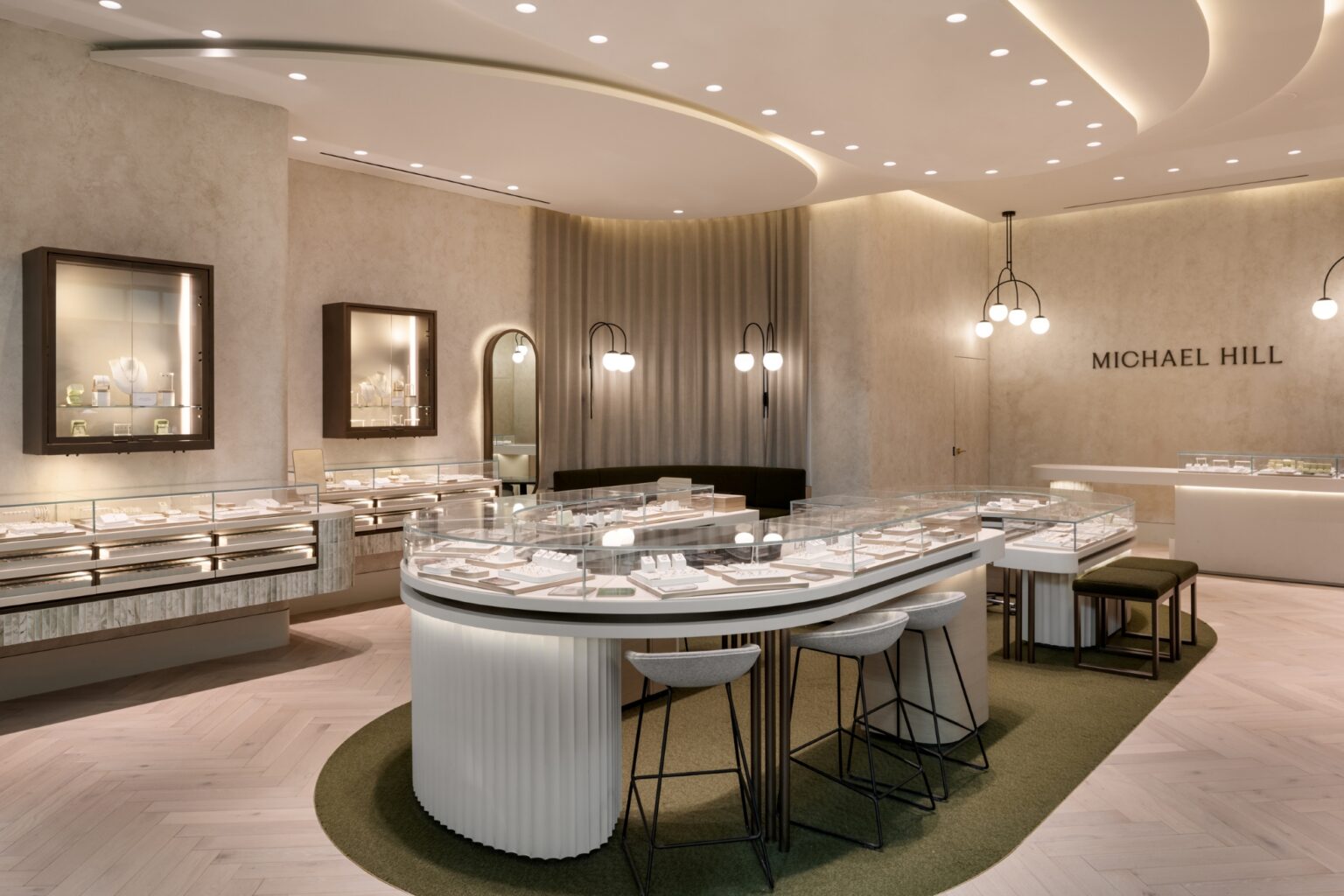
Retail store design ideas that improve layout performance
Some of the most effective retail store design ideas are small layout moves rather than large design gestures. The following are ones we return to often, because each one addresses a common reason a floor underperforms.
- Use flooring to draw the path. A change in material or tone, chosen from durable commercial flooring materials, along the main aisle guides customers without signage and makes a racetrack or loop legible at a glance.
- Put a destination at the back. Fitting rooms, a service point, or the most searched-for category pulls traffic through the full depth of the store.
- Build flexibility into the fixture plan. Modular floor fixtures on casters, and wall systems with adjustable standards, let the layout evolve with the range instead of locking it in on opening day. Our article on customizing fixtures looks at this in more depth.
- Plan power and data for the future. Floor boxes placed where feature tables are likely to go make it possible to add digital displays or demo stations later without trenching the slab.
- Give fitting rooms room. Fitting room areas with a seat for a companion and a mirror outside the cubicle keep groups in the store longer.
None of these ideas depend on a large budget, and our earlier article on retail store design ideas on a tight budget covers more ways to stretch a fit-out. They depend on making decisions early, while the plan is still on paper and a change costs an hour of drafting rather than a week of construction.
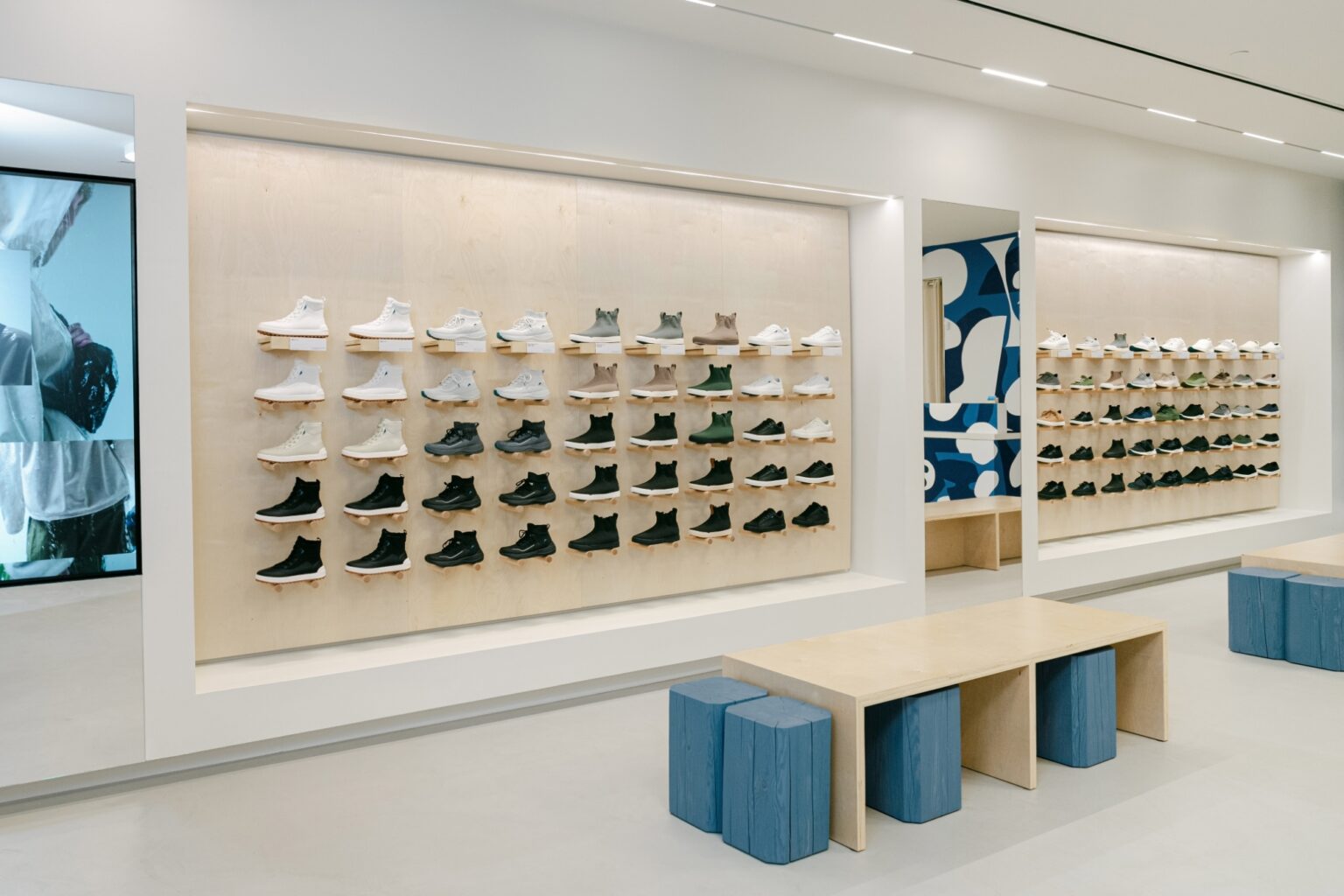
How to design a retail store with your design team
The best layouts come from a clear brief and early involvement. Retailers who bring their designer in before the lease is signed get more options, better negotiating information, and fewer surprises during construction. The process below reflects how a well-run retail fit-out typically unfolds.
- Share your trading data. Sales by category, SKU counts, stock depth, staffing levels, and your best and worst performing zones in existing stores all inform the plan.
- Test fit the unit before signing. A test fit shows how much net selling area the unit really offers and whether the layout type you want actually works in it, and it gives you numbers to negotiate your tenant improvement allowance.
- Review the landlord’s design criteria. Premium centres set requirements for storefronts, bulkheads, lighting, and materials that affect the layout and budget, and they shape every step of the tenant improvement process in BC.
- Compare layout options. Ask for two or three schematic plans, each with a fixture count and a net selling area, so the choice is based on numbers as well as appearance.
- Check code and accessibility early. Aisle widths, counter heights, fitting room sizes, and exits should be confirmed before fixtures are detailed.
- Detail the fixtures with the plan. Fixture design and floor plan should develop together, since a change to one affects the other.
- Measure after opening. Review sales by zone after the first few months and adjust fixtures and merchandise placement based on what the numbers show.
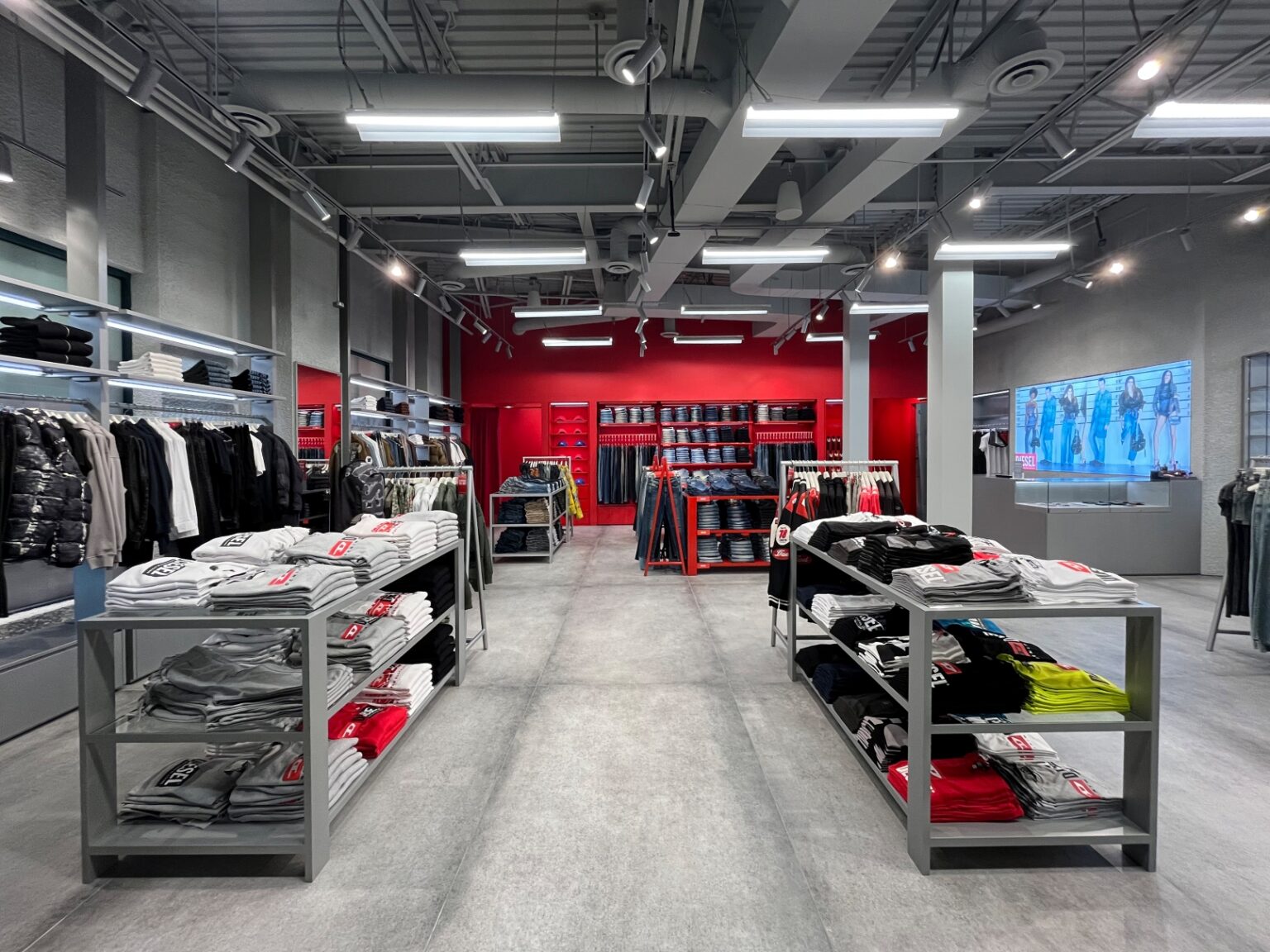
Working with a team that knows both the design and the construction side keeps this process grounded. At Cutler, our retail and showroom practice has delivered projects from pop-up shops in Whistler to flagship units in Toronto, including stores for Michael Hill Jewellers at CF Pacific Centre and Yorkdale, Vessi at Square One, Samsung at Yorkdale, Diptyque at Pacific Centre, and Diesel at McArthurGlen in Richmond. We also maintain working relationships with landlords, brokers, contractors, and vendors across Canada, which helps keep a fit-out on schedule once the design is approved. For a sense of how layout decisions translate into construction costs, our 2025 BC Tenant Improvement Guide puts full retail and showroom fit-outs of 1,000 to 5,000 square feet, starting from a warm shell, at $100 to $150 per square foot for base quality, $150 to $225 for medium quality, and $250 or more for high-end work. Our article on value engineering in interior design explains where to spend and where to save.
Frequently Asked Questions
What are the main types of retail store layouts?
The four main retail store layout types are grid, racetrack (also called loop), herringbone, and free-flow. The grid uses parallel aisles to hold the most product and suits grocery, pharmacy, and high-SKU retail. The racetrack circles the store with a defined main aisle and exposes customers to most of the range. The herringbone runs a central aisle from front to back with angled runs off both sides, which suits long, narrow units. Free-flow uses an open arrangement of fixtures and is standard for fashion, beauty, jewellery, and lifestyle brands. Many stores combine two of these, such as a perimeter loop with a free-flow core. The right choice depends on the shape of the unit, the size of the range, and whether customers arrive on a mission or come to browse.
How wide should retail store aisles be in BC?
Under the 2024 BC Building Code, an accessible path of travel generally needs a clear width of at least 1,000 mm, and it may narrow to 850 mm only for short sections no more than 600 mm long. Where an accessible path narrower than 1,500 mm runs for more than 12 metres, it must end in a turning space of at least 1,700 mm in diameter or an equivalent area. Those figures are minimums, not targets. Main aisles in most stores work better at 1,500 to 1,800 mm, which lets two people pass comfortably and gives browsing shoppers room to stand at a fixture without being brushed from behind. Projects in the City of Vancouver follow the Vancouver Building By-law instead, so confirm the applicable requirements with your designer early.
What is the decompression zone in retail store design?
The decompression zone, also called the transition zone, is the area immediately inside a store’s entrance where customers adjust to the change from the street or mall concourse. Research by retail analyst Paco Underhill found that shoppers tend to overlook merchandise and signage placed in this zone, because they are still orienting themselves. Product placed there is largely wasted. The practical response is to keep the zone open and uncluttered, then place the first strong display just beyond it, often on the front-right where the eye naturally travels. The zone scales with the store: a small boutique may need only 5 to 6 feet, while a large-format store may need 10 to 15 feet before customers are ready to engage.
How do you calculate fixture space vs. traffic flow in retail space planning?
Start with the gross leasable area, then subtract back-of-house, fitting rooms, the cash wrap and queue, and the decompression zone to find the net selling floor. Plan the aisles next, using the building code minimums as a floor rather than a target. In BC, accessible paths of travel generally need at least 1,000 mm of clear width, and most main aisles work better at 1,500 to 1,800 mm. The area left after circulation is what is available for fixtures. As a rough guide, circulation often takes 40 to 50 percent of the net selling floor in apparel and lifestyle stores, and less in a dense grid layout. In a typical specialty store, that can leave less than half of the leased area under a fixture. A test fit on the specific unit is the most reliable way to confirm the numbers before you commit.
Where should the sales counter go in a retail store?
The sales counter, or cash wrap, anchors the customer journey, since every buyer ends there. Because most shoppers move right and circulate counter-clockwise, a counter at the front-left lets customers finish their loop at the till and gives staff a clear view of the entrance for greeting and loss prevention. The queue area also becomes valuable space for small, add-on merchandise. Other positions suit other formats. A counter at the back of a jewellery or luxury store can act as a destination that draws customers through the space, while a central island suits boutiques that rely on personal service. In BC, at least one section of a service counter must meet accessibility requirements, including a maximum height of 865 mm and, where forward-facing interaction is required, knee space underneath.
Bringing it all together
A retail store layout is a set of decisions about where customers walk, what they see, and where they stop. Choosing the right layout type for your unit and range, respecting how shoppers actually behave, protecting the sightline to the back wall, and sizing circulation from the aisles outward will do more for sales per square foot than any single finish or fixture. Retail space planning turns those decisions into numbers you can test before construction begins.
The most valuable moment to plan is before the lease is signed, while the layout, the fixture count, and the net selling area can still inform which unit you choose and how you negotiate. If you are planning a new store, a relocation, or a refresh of an underperforming floor, our team would be glad to help. Reach out to Cutler to discuss your space and your goals.